Modernizing A B2B Website
While working at MorelandConnect, I was responsible for managing and publishing web pages for the company website. I used Figma to design mockups and then implemented them on WordPress.
THE GOAL
The goal was to redesign the website using existing content, making it functional and modern. My primary objectives were to give users quick access to other pages, provide information in a concise and coherent way, and include multiple calls to action on a single page for easy contact access.
This project was a new avenue for me, as it was the first time I was designing with the B2B aspect of our clientele in mind. I worked closely with our marketing firm, which advised me on what buttons needed to be added and where they should be linked. The previous design also did not scale down well to mobile, so the new desktop design was made with potential mobile users in mind. My research included studying B2B businesses and their websites, including what a user looks for when navigating a B2B website.
Before
After


One of the harder challenges was getting a banner and navigating around the red theme of the company as it is challenging to show that color as positive. Another thing was designing links to other pages and making them obvious to users. There were instances of buttons not appearing as buttons in the original site as well as inconsistent hero banners. My job was to clean this up and make everything more consistent.
The reasoning for adding the banner in the middle of the page was so that the reader would not have to scroll to the footer or the top and can simply add their email, to get in touch with MorelandConnect.
Prototypes


Adding New Pages
.jpg)
.jpg)
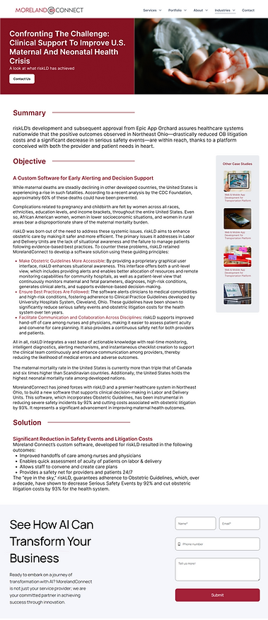
There were other pages that needed to be designed from scratch since they were not on MorelandConnect's website. One such page was for case studies. The reason for adding case studies was purely for SEO purposes. Therefore, the page needed to include a large volume of text while being easy to read and parse.


I pushed for more consistency across pages hence once I settled on a style that is what we followed. Now the design is consistent throughout the services, home and case studies page. The main identifier for the new look is the hero banner. The sidebar was added to increase the visibility of other case studies and therefore increasing the clicks on website.
The above is an early prototype when I had still not thought of a new hero banner style.
RESEARCH, ENGAGEMENT AND IMPACT
What I achieved while working on this website:
-
Conducted extensive user research to understand client needs.
-
Implemented design changes that improved engagement.
-
Improved my skills in Figma, primarily used Auto Layout functionality which was really helpful.
Thanks to the SEO optimization, the MorelandConnect website became one of the most visited and visible tech company websites in Ohio.
Working on this I realized there are skills that can also transfer over to UX in gaming:
-
Interactive Prototypes: My experience designing wireframes and prototypes equips me to rapidly iterate on game mechanics and user interfaces, ensuring they meet player expectations.
-
Accessibility and Engagement: By conducting research and analyzing user behavior, I learned how to create designs that are accessible and engaging—skills that are invaluable for designing tutorials, onboarding experiences, and interactive narratives in games.
Description
Product Details
The MorelandConnect website redesign was a UX/UI project aimed at modernizing the company's online presence and improving user navigation. The project focused on creating a responsive, user-friendly design that catered to the needs of manufacturing and financial businesses in the Midwest. The result was an optimized website that became one of the most visited tech company websites in Ohio.
My Role
-
Conducted user research to understand client needs and expectations.
-
Designed wireframes and prototypes for improved navigation flow.
-
Collaborated with the marketing team to align designs with business goals.
-
Focused on UX principles to enhance accessibility and engagement.